
The Untapped Potential of Your Website Footer
When you build a website, it is incredibly easy to focus all your energy on the homepage. You obsess over the main navigation, the hero image, and your primary calls to action. But there is another critical area that deserves just as much strategic attention.
The website footer sits at the very bottom of your web pages. It is the final section visitors see when they scroll. Because it comes at the end of the user journey, many site owners treat it as an afterthought.
Treating your footer as a dumping ground for random links is a massive missed opportunity. Instead, your footer should act as a reliable navigation hub. It supports your visitors, reinforces your brand, and catches users before they leave your site completely.
The great news is that you do not need advanced technical skills to create an effective footer. With a thoughtful approach and the right structural strategy, you can turn this often overlooked section into a highly valuable asset.
What is a Website Footer?
A website footer is the structural section located at the very bottom of a web page. It signals to visitors that they have reached the end of the primary content. It provides one final opportunity to guide them toward important information.
Visually, the footer is usually separated from the rest of the page. Web designers achieve this by using a different background color, distinct spacing, or a solid dividing line. Functionally, it plays a massive role in overall site usability.
This specific space is specifically designed to support the user experience. It houses essential details, legal documentation, and helpful navigation links. An effective website footer reinforces credibility and makes your website feel complete.
Comparing Website Sections
| Website Section | Primary Purpose | Key Elements Included |
| Header | Initial navigation and brand introduction | Logo, main menu, search bar, cart icon |
| Body Content | Delivering value and answering search intent | Articles, product details, images, videos |
| Footer | Secondary navigation and legal compliance | Copyright, policies, contact info, social links |
Top 5 Reasons Why Cheap Website Development is a Mistake
Why Website Footers Matter for User Experience
Imagine a common scenario that happens millions of times a day across the internet. A visitor lands on a website looking for a specific piece of information. They scan the top navigation menu but do not see what they need.
They begin to scroll down the page. They keep scrolling past your beautiful images and perfectly crafted marketing copy. Finally, they hit the very bottom of the page. If your footer is well organized, they will find exactly what they were looking for right there.
Your footer acts as a safety net. A comprehensive study by Chartbeat analyzing 25 million website visits proved that users regularly scroll thousands of pixels deep. No page is too tall for a determined user, and no footer is too far away.
27 Essential Elements to Include in Your Website Footer
Website footer design is ultimately about making smart choices. You must choose what to include with the clear intention of helping visitors while meeting your business goals. Here are 27 elements you can include in your footer.
1. The Copyright Notice
If your footer only contained one single element, it should be the copyright notice. This usually includes the copyright symbol, the current year, and your business name. It offers a layer of protection against website content plagiarism.
Pro Tip: Manually updating your copyright year every January is tedious and easily forgotten. An outdated copyright year makes your business look unprofessional and neglected. We highly recommend using a free WordPress plugin to automate this process completely.
Introducing the Dynamic Copyright Year Customizer
The Dynamic Copyright Year Customizer is a completely free, lightweight WordPress plugin designed to solve this exact problem. It helps you effortlessly manage and display a dynamic, up to date copyright notice on your site.
You can easily add custom text before and after the current year. For example, you can format it as "© 2026 Your Business Name. All Rights Reserved." This plugin ensures your legal notices stay accurate year after year without any manual coding.
Key Features of the Dynamic Copyright Year Customizer:
- Automatic Updates: The displayed year changes automatically when the calendar year rolls over.
- Custom Text Fields: Personalize your legal text to match your specific brand requirements.
- Gutenberg Block Support: Drop the dynamic copyright block directly into any widget area, post, or page.
- Shortcode Integration: Use the specific shortcode to embed the dynamic year exactly where you want it.
- Elementor Compatibility: Seamlessly integrates with popular page builders for custom footer designs.
- Lightweight Performance: Written with clean code to ensure it never slows down your website load speeds.
By installing this plugin, you save time, improve user trust, and secure your intellectual property. You can download the Dynamic Copyright Year Customizer for free from the WordPress plugin repository today.
2. HTML Sitemap Link
This is one of the most traditional links found in website footers. It points visitors to an HTML version of your sitemap. While human visitors rarely click this link, it is highly beneficial for search engine bots indexing your website content.
3. Privacy Policy
The privacy policy is a mandatory element for modern websites. This page explains exactly what data your website collects and how that data is utilized. If you use analytics software or email signup forms, you are legally required to have this link.
4. Terms of Use
Terms of use pages outline the specific rules a visitor agrees to by browsing your website. For businesses in highly regulated industries, the terms of use provide essential legal protection. Placing this in the footer ensures it appears on every single page.
5. Contact Information
Visitors naturally expect to find a contact link in the bottom corner of your website. This should link directly to a dedicated contact page featuring a secure form. Avoid placing a raw email address in your footer as it attracts massive amounts of spam.
6. Address and Map Links
Physical location information is vital for local search engine optimization. Adding your business address helps search engines understand your geographic relevance. Linking that address to a map application helps mobile users find your physical storefront easily.
7. Clickable Phone Numbers
Just like a physical address, a local phone number acts as a strong local business signal. On mobile devices, this phone number should be programmed to trigger a phone call when tapped. This removes friction for users trying to reach your sales team.
8. Expanded Secondary Navigation
Modern web design frequently utilizes the "fat footer" concept. This involves adding organized columns of links similar to a mega menu. This helps visitors who failed to find what they needed in your primary header navigation.
9. Social Media Icons
We love gaining traffic from social networks, but we do not want visitors leaving our sites prematurely. Placing social media icons in the header often distracts users from buying. The footer is the perfect place to link out to your social media profiles.
10. Social Media Feeds
Some brands go a step further and embed live social media widgets directly into the footer. This displays your latest posts in real time. This strategy works well if your brand maintains a highly active and visually appealing social media presence.
11. Email Newsletter Signup
The website footer is an incredibly common location for email capture forms. Visitors who scroll to the very bottom of your content are usually highly engaged. Adding a simple email input box allows you to capture these high intent prospects easily.
12. Login Portals
Not every website visitor is a brand new prospect. Many visitors are existing employees, partners, or returning customers. A discreet login link in the footer serves these returning users without cluttering your primary marketing navigation.
13. Press and Media Resources
Journalists and media professionals make up a very tiny percentage of your overall website traffic. You should not waste premium header space on a press kit link. Media professionals are trained to scroll to the footer to find corporate assets.
14. Site Search Tool
If a visitor has scrolled completely to the bottom and still cannot find their desired content, a search bar is their final lifeline. Including a search input field in the footer is an excellent usability feature for content heavy websites.
15. Brand Imagery
You can easily elevate the visual appeal of your footer by incorporating images. This is a fantastic opportunity to inject personality into an otherwise text heavy area. Photos of your founding team or office space work exceptionally well here.
16. Mini Image Galleries
Instead of a single image, some creative brands incorporate an entire mini gallery. This creates a highly engaging visual element at the bottom of the page. Clicking these small thumbnails can open larger images in a dynamic lightbox overlay.
17. Secondary Branding and Logos
Your footer is a great place to reinforce your brand identity. Many companies choose to display an alternate version of their main logo here. For example, if your header uses a colorful logo, your footer might use a sleek monochrome variation.
18. Mission and Value Statements
Why not remind your visitors exactly why you are in business? The footer offers excellent real estate to plant your flag and state your core values. A short two sentence mission statement leaves a lasting impression on your readers.
19. Contextual SEO Keywords
Because footer text appears on every single page of your site, it helps indicate relevance to search engines. You can naturally weave your primary keywords into your short mission statement. However, you must avoid keyword stuffing at all costs.
20. Awards and Trust Badges
Award logos and security badges immediately instill confidence in your prospective buyers. These graphical elements serve as powerful social proof. Gathering all your industry certifications into a visual trust box at the bottom of your site boosts conversions.
21. Association Memberships
Being a part of prestigious industry associations carries weight with consumers. Chambers of commerce and professional organizations usually provide member logos. Placing these authoritative graphics in your footer elevates your brand perception.
25 Benefits of Building a Business Website in 2026
22. Client Testimonials
Including a brief text testimonial in your footer provides social proof across your entire website. The best approach is to feature a short, impactful quote praising your customer service. This subtly reassures visitors as they navigate through different pages.
23. Latest Blog Articles
If your company invests heavily in content marketing, you want to maximize the visibility of your posts. Dynamically pulling the titles of your three most recent blog posts into the footer keeps your site looking active and updated.
24. Upcoming Company Events
If your organization frequently hosts webinars or live events, the footer is an excellent promotional space. Any link placed in the footer benefits from high visibility across all web pages. Make sure to keep this section rigorously updated.
25. Welcome Videos
Video is widely considered the most compelling form of digital content available today. Embedding a short, high quality welcome video in your footer creates a deeply memorable experience. It allows you to speak directly to your audience on every page.
26. Audio Clips or Jingles
While quite rare, embedding a subtle audio player can work for specific brands. If your company has a recognizable radio jingle or podcast, placing a play button in the footer adds a unique multimedia layer to the browsing experience.
27. The Final Call to Action
Every single marketing page needs a clear call to action. Adding a prominent CTA button to your footer ensures one is always available. You must never leave a website visitor wondering what exact step they are supposed to take next.
8 Brilliant Website Footer Examples from Major Brands
To truly understand effective footer design, we must analyze how successful global companies structure their layouts. Reviewing practical implementations helps us grasp how theory translates into exceptional user experience. Here are eight distinct examples of enterprise level footer designs.
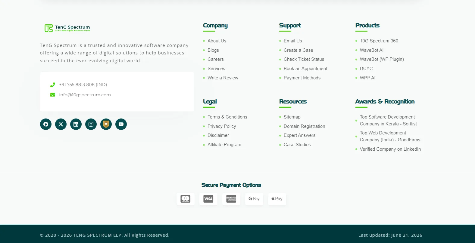
1. TenG Spectrum
Our footer is broken down into highly logical columns including Company, Support, Products, Legal, Resources, and Awards & Recognition. We highlight our proprietary AI integrations like WaveBot AI and display our prestigious top software development awards. Furthermore, we include clear, secure payment options and clearly display our primary official contact channel.
2. OPPO
OPPO utilizes a striking dark mode aesthetic for their global website footer layout. This design choice provides excellent visual contrast and immediately signals the end of the page content.
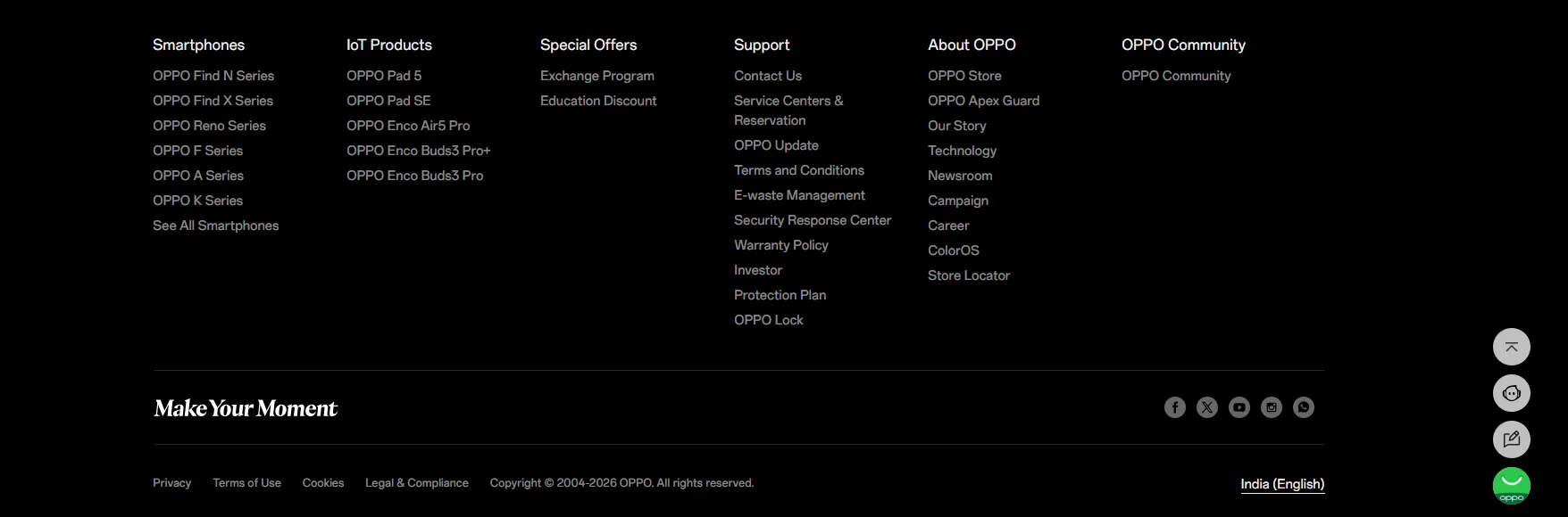
The OPPO footer intelligently categorizes their massive product catalog into sections like Smartphones and IoT Products. They provide an extensive Support column detailing service centers, warranty policies, and e-waste management. This comprehensive layout serves both new prospects researching hardware and existing customers seeking technical assistance.
3. GoDaddy
GoDaddy relies on a footer that is heavily optimized for absolute clarity and user navigation. It features neatly organized columns dedicated to specific product links, robust customer support resources, and corporate investor information. They also include highly visible trust signals and secure payment badges to constantly reassure potential buyers.
4. Dell
Dell provides a masterclass in organizing complex B2B and B2C information within a single footer layout. They utilize a clean, light grey background that feels highly professional and corporate.
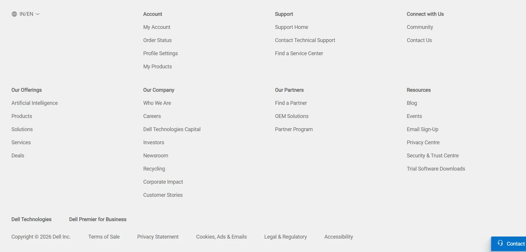
The Dell footer segments information into clear pillars like Our Offerings, Our Company, Our Partners, and Resources. They prominently feature advanced solutions like Artificial Intelligence alongside standard consumer products. Finally, a highly visible blue contact button remains anchored in the corner for immediate sales support.
5. Amazon
Amazon treats its global website footer as a massive, highly efficient utility hub for rapid shoppers. It is densely packed with highly specific links directing users to order tracking, return policies, and detailed account settings. This utilitarian structure drastically reduces their customer service overhead by empowering users to find answers independently.
6. The New York Times
As a massive, globally recognized publishing platform, The New York Times relies on a navigation heavy footer layout. It systematically categorizes links by major news sections, various subscription services, and highly detailed legal documentation. This extensive catalog prevents avid readers from having to scroll all the way back to the top to switch news categories.
7. Walmart
Walmart focuses strictly on high speed consumer convenience in its overall footer layout and design. It highlights crucial, time saving services like curbside pickup options, local store directories, and dedicated customer service portals. The entire structure is psychologically designed to transition a user from casual browsing directly into an active purchasing mindset.
8. Apple
Apple completely separates its footer from the main product presentation pages using a sleek, minimalist dividing line. The layout features a highly structured, text based site map covering everything from hardware categories to corporate environmental initiatives. It feels incredibly organized, premium, and technically precise, perfectly reflecting their core brand identity.
How to Build and Place a Footer on Your Website
Creating a professional website footer requires different approaches depending on the platform you are using. Here is exactly how to implement a footer across different development environments.
Building a Footer Using HTML and CSS
If you are coding a website entirely from scratch, you will use the semantic HTML footer tag to define the area. To ensure the footer stays anchored at the bottom of the screen, developers rely on CSS layout modules.
Using CSS Flexbox or CSS Grid allows you to structure the page dynamically. This guarantees that your footer remains at the absolute bottom of the browser window, even if the page contains very little text. This approach ensures consistent visual polish across all devices.
Creating a Footer in WordPress
WordPress makes footer customization incredibly visual and user friendly. The exact process depends heavily on the specific theme you have installed. For traditional themes, you simply navigate to Appearance and click on Customize in your dashboard.
In the customizer menu, you will find a dedicated section for footer widgets. You can drag and drop text blocks, navigation menus, and images without writing a single line of code. This is also exactly where you would place your Dynamic Copyright Year Customizer block.

If you are using a visual page builder like Elementor or Divi, the process is even simpler. You create a global footer template, drag your desired elements into the columns, and assign the template to display across your entire website.
Utilizing Managed Website Builders
Platforms like GoDaddy or Wix offer drag and drop interfaces for instant footer creation. These managed builders provide professionally designed layout templates right out of the box. You simply select a style you prefer and replace the placeholder text with your own.
These integrated tools ensure your footer is automatically mobile responsive. The layout will shift dynamically to look perfect on smartphones, tablets, and desktop monitors alike. Mobile responsiveness is absolutely critical for modern user experience and search engine rankings.
Website Footer Design Best Practices
Knowing what to put in a footer is only half the battle. You must also design it visually so that it is easy to read and interact with. Follow these specific design principles for the best results.
Strategic Color Contrast
The vast majority of premium websites use a dark background color for their footer with light text on top. This stark color inversion acts as a powerful visual cue. It clearly signals to the human brain that they have reached the end of the content.
The Sticky Footer Concept
A sticky footer remains locked at the bottom of the browser viewport regardless of how far the user scrolls. The main content of the page slides underneath the footer as the user moves down. This guarantees your most important links are visible at all times.
Organizing with Hierarchy
Do not simply dump fifty links into a single massive paragraph. You must organize your links into logical vertical columns. Use bold, clear heading titles for each column so visitors can scan the options quickly and easily.
Why Your Website Is Not Getting Leads (Fix This First)
Elevate Your Digital Presence Today
Your website footer is far more than just a place to stick a copyright notice. It is a critical component of your site navigation, brand building, and conversion strategy. Designing it correctly requires a deep understanding of user psychology and modern web development standards.
If you want to ensure every single pixel of your website is optimized for growth, you need an expert partner. TenG Spectrum is a premium remote website development and digital solutions company dedicated to elevating brands online.
Our experienced team specializes in comprehensive digital strategy, high performance web development, and advanced SEO techniques. We build websites that not only look incredible but function flawlessly to drive real business results.
Stop letting your website traffic slip through the cracks of a poorly designed interface. Contact TenG Spectrum today to discuss how our premium web development and SEO services can transform your digital footprint and accelerate your business growth.
Frequently Asked Questions
Find quick answers to common questions about this topic