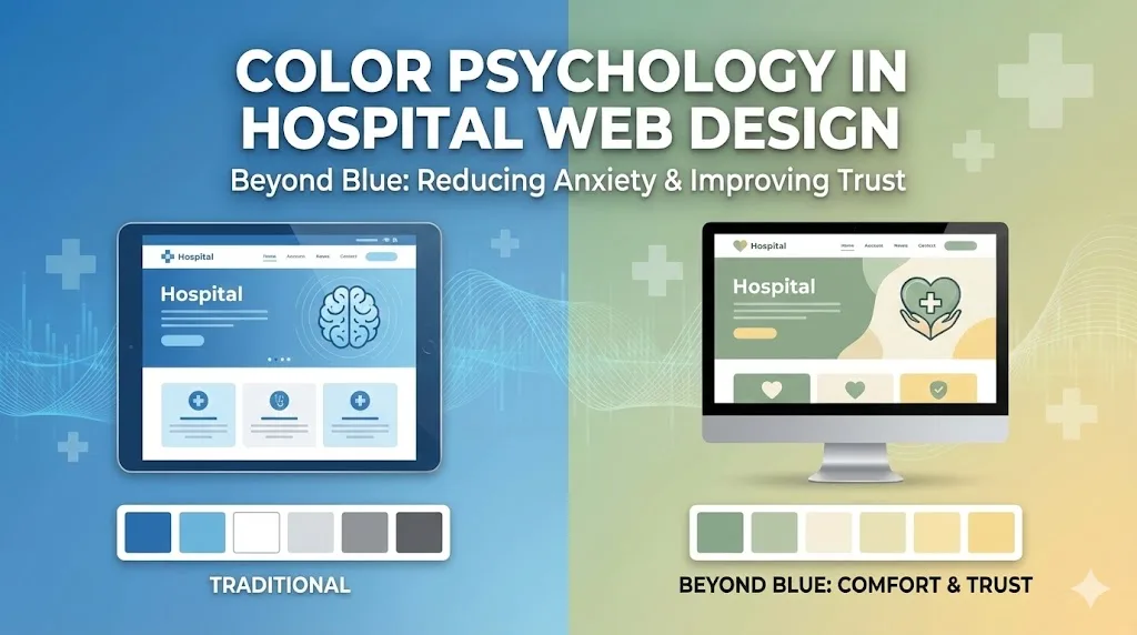
The Power of Color in Patient Experience
Effective hospital web design uses color psychology to shift the patient experience from clinical coldness to empathetic care. While traditional "medical blue" signals professionalism, modern healthcare interfaces incorporate warmer neutrals and soft greens to actively reduce patient anxiety and improve cognitive accessibility.
Why Visual Comfort Dictates Patient Trust
The primary goal of a healthcare interface in 2026 is to lower the cortisol levels of the user. Patients visiting a hospital website are often in a state of high stress or urgency. High-contrast, clinical whites and harsh blues can inadvertently trigger "white coat syndrome" digitally, causing users to feel overwhelmed. By integrating a palette of "healing tones" such as sage, muted teal, and warm greys, designers create a calming environment that encourages clear decision-making.
Furthermore, color strategy must align with modern accessibility frameworks. Using high-legibility palettes ensures that patients with visual impairments or neurological sensitivities can navigate the site without friction. In a remote-first digital landscape, your website is the virtual "front door" of the clinic; its color scheme must reflect the same bedside manner expected from a physical healthcare provider.
Strategic Color Implementation for Healthcare UI
To move beyond generic blue, consider these color applications based on psychological impact:
- Muted Greens (Stability): Best for surgical or intensive care sections to represent growth, health, and calm.
- Soft Earth Tones (Reliability): Use tans or warm greys for background elements to provide a grounded, non-threatening atmosphere.
- Soft Yellows or Oranges (Optimism): Best for pediatrics or maternity wards, used sparingly as accent colors to evoke warmth and hope.
- Deep Navy (Authority): Reserved for typography or navigation bars to maintain a sense of clinical expertise without dominating the visual field.
| Color Category | Psychological Association | Recommended Use Case |
| Healing Greens | Tranquility & Renewal | Wellness Programs / Recovery Info |
| Warm Neutrals | Comfort & Safety | General Navigation / Patient Portals |
| Deep Blues | Trust & Competence | Emergency Services / Surgeon Bios |
Frequently Asked Questions
Find quick answers to common questions about this topic